Sep 10, 2012 | cards, rubber stamping
 wow – look at that – a whole week since I last posted?! APOLOGIES!! It's been a bit of a whirlwind trying to get back into routines – back to school, back to regular activities…and then there were some server issues which (fingers crossed) are hopefully resolved.
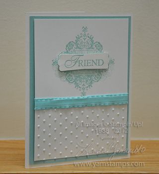
Anyway, I'm back to share this card with you that class and club members will be making this month. I love monochromatic cards for their ease of production and elegance. This one features Pool Party, one of my favourite shades of blue. It is an In Colour 2011-2013 so that means I still get one more year with it before it retires, so I'm making the most of it! This card uses the coordinating Pool Party ruffled ribbon and the set Affection Collection from the Holiday Catalogue.
If you are interested in becoming a club member, you can contact me for information. The current club season is starting NOW but you can start at any point for a six month period. If you are like some of my customers who are snow birds, your other option is to attend my monthly card classes when you are able. See my classes and events page for more information.
A final reminder that if the server has issues again, you can also get a hold of me through Twitter or Facebook. Plus, if you become a "fan" of the facebook page, you get access to a free video tutorial!!
Jul 27, 2012 | rubber stamping
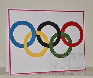
I did a previous post a couple of years ago in honour of the Vancouver Winter Olympics, and I thought I'd do another version in honour of the London Summer Olympics, which open today – woohoo! I can't decide which event I'm most excited to watch, but I know that since I've started running, I have a totally new appreciation and insight into the running events. This year, I'll be very busy watching the opening ceremonies as well, as a friend of mine will be participating as a performer! I will be trying to pick her out in the crowd on the field…thank goodness for DVRs! I made this card to send to her in honour of her performance, which I'm sure will be wonderful.

The rings are all current Stampin' Up! colours – Pacific Point, Basic Black and Real Red on the top row, Daffodil Delight and Garden Green on the bottom row. I used the 1-1/4" circle punch first, then centred the hole in the 1-3/4" circle punch to create the ring. I then cut slits in all the rings so I could interlock them like the official symbol. I realized afterwards that I could probably have gotten away with just slitting the yellow and green rings… but I need all the help I could get to get them positioned correctly!! I have a background of Melon Mambo as the London Olympics are using a similar colour on the logo.
I will most likely have the games on the TV while we do our Christmas Stamp a Stack on Sunday, playing in the background in case people want to keep track of how things are going. If you'd like to join us, please let me know ASAP!! We'll be starting at 1pm – cost includes all supplies and envelopes for 8 cards, 2 tags and will include a whole roll of stitched Real Red ribbon for you to use (and keep the remainder!). Don't forget these will be monthly events, so start building up your card stash now!
Jul 16, 2012 | cards, rubber stamping
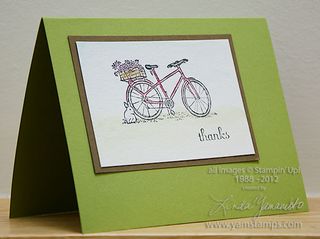
 I love to watercolour…even though I'm not that good at it! I have to confess that drawing, painting etc are definitely not strong skills of mine – which is why I love rubber stamping! Stampin' Up! has made it easy for me to look artistic without me having to do the "heavy lifting" as they say :) For this card, I stamped the bicycle image from the hostess only set "Summer Afternoon" (check the back of the Stampin' Up! Catalogue to see the stamp set). I used Stazon Jet Black ink on watercolour paper to be sure that my image would stay clear once I soaked the paper. I then used my aquapainter and my Watercolour Wonder crayons to colour in the image. This is my favourite way to add watercolour to my images – I can control the amount of water used and can direct the colour where I want it. Takes me back to my watercolour painting class days without the anxiety of hearing "Oh, just sketch out what you want to paint". (See back to initial comment about not being able to draw).
I created these cards to send to everyone who sponsored me (and my son) in our recent bike ride efforts. We participated in "The Healing Cycle" which is a varying distance bike ride to raise funds for hospice care. We had a lot of fun and were thrilled to raise over $18,000 with our teammates for the Carpenter Hospice here in Burlington. The Carpenter Hospice not only provides end of life care but also runs wellness programs for those living in the community with terminal illnesses. I know a number of people who have benefitted from the valuable services that the staff and volunteers provide, so spending some of my time to raise funds for them was not an issue at all, nor was spending a bit of time on creating special thank you cards for my friends and family who gave generous donations to sponsor our efforts.
Jul 12, 2012 | cards, rubber stamping
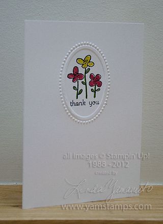
 One type of card that is always a pleasant surprise to receive is a "Thank You" card. In this day of technology, it's sadly becoming a bit of a rare occasion to receive a "nice" piece of mail (as opposed to bills and flyers!) – so it's great to receive a card for a change. A handmade card is even better! Thank you cards can be sent to anyone to whom you want to express your gratitude.
These cards were quickies that I made to send to attendees at my Open House in July. I personally think that the embossing around the image dresses up this simple card. Stampin' Up!'s Easy Events set is another versatile multi-occasion set that will cover many of your card sending needs. The Designer Frames Textured Embossing Folder set (for use with the Big Shot) was one of the items you could select for free during Sale-a-Bration but is also available in the main Stampin' Up! catalogue. I added a bit of colour with my Stampin' Write markers – I used the In Colour '12 – '14 set and was able to produce a number of these fairly quickly. With me, I've learned I need to get the cards done and out, otherwise they get bogged down in the system somewhere. (By system I mean my stamping room chaos or somewhere en route to the actual mail box…LOL). I've also started using custom post it notes inside the cards to my customers so that they can be re-used by the recipient 🙂 or kept for a sample, whatever suits that person's needs at the time!
(By the way, if you attended my Open House and haven't received one of these – please let me know!!).
By the way – thank you for taking time out of your day to check out www.yamstamps.com – I appreciate it!
Jul 10, 2012 | cards, rubber stamping
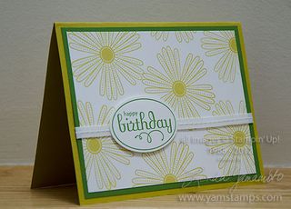
 This card uses some of Stampin' Up!'s new In Colours. So glad that the In Colours hang around for two years now – gives me more chance to play with them! Summer Starfruit and Gumball Green are the featured colours here…and I have to admit that when I first saw Summer Starfruit I wasn't really sure about it….but I love it on this card! Mixed Bunch is one of my favourite sets right now and I love the versatility of the set Perfect Punches.
This card is not complicated to make but I think has great impact, which is how I like to work! I often find that I need a card for an occasion moments before I need to send it or give it…so cards like this fit into my life perfectly!
Don't forget that my monthly card classes continue in the summer, and my Christmas Stamp a Stacks start at the end of July!! Please see my events page for more information or contact me if you have any questions.
Jun 17, 2012 | cards, rubber stamping
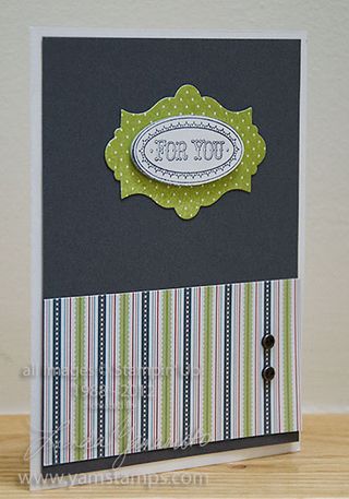
 At each of my cardmaking classes, I will usually try to include a masculine card as one of the projects – most of my customers mention that these are the types of cards they need but often don't have on hand. Designer Series Paper is a great way to get a masculine feel to a card, even if your image or sentiment isn't screaming "Hey! This is a guy's card!"
I took inspiration for this colour combination from the Twitterpated Designer Series Paper used at the bottom. "Work smarter not harder" – or more likely "The Lazy Crafter Strikes Again" LOL. Anyway, the image is from the Layered Labels set. Now, we did have to stamp this one twice and clean the stamp in between so that did require a _bit_ more effort… Stamped first in Lucky limeade and then in Basic Grey, cut out using the Apothecary Arts framelits and the Large Oval Punch. A few brads from the Vintage Trinkets and it's done and ready to be presented to your favourite guy.
Happy Father's Day to all the Dads out there, and those who fulfill a male role model position in someone's life – be it through teaching, coaching, mentoring and/or friendship! Thanks for being part of the village that raises the children.
 wow – look at that – a whole week since I last posted?! APOLOGIES!! It's been a bit of a whirlwind trying to get back into routines – back to school, back to regular activities…and then there were some server issues which (fingers crossed) are hopefully resolved.
