In all honesty, the end of August and almost all of September feel like a bit of a blur to me. There was a LOT going on, but I feel like things are getting back into a routine.
I did take part in another Stampin’ Up! Canada Demonstrator only card swap featuring products from the September-December 2026 Catalogue. I always love these swaps for new ideas and inspiration. I’ve shared one of my swap cards here on YamStamps.com on the Sunday Swaps Page – and here’s the other design I created since I took part in two groups.
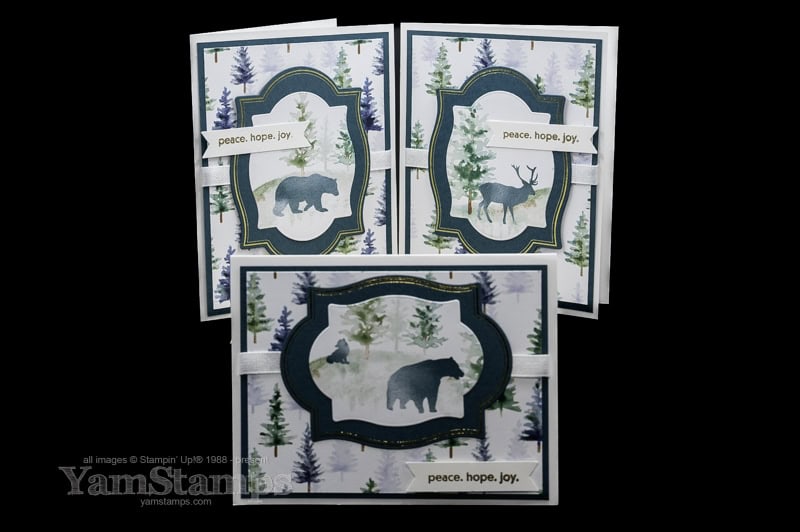
I used the Flourish & Frames Hot Foil Dies to create the frames and focal images, and gold embossing for the sentiment from Soiree Salutations with the Three Banner Punch. The Whispering Woods Designer Series Paper did the rest of the work! I love the colours in this DSP, and I also feel a little more virtuous using it because Stampin’ Up! donates $4CAD from each purchase to various charities world wide that are dedicated to empowering women.
TIME LIMITED NEW DEMONSTRATOR SPECIAL
When you sign up and pay the $135 CAD fee to join as a Stampin’ Up! Canada Demonstrator, you receive a $170 CAD coupon code to use toward Stampin’ Up! products of your choice in your own online store.
During October, there’s also a BONUS when you join as a Demonstrator! You’ll receive $70 CAD in Stampin’ Rewards that you can apply toward any purchase during your first three months as a Demonstrator. Stampin’ Rewards is the customer rewards program, where you typically earn 10% of your product total to use toward a future purchase. One of the things I appreciate about Stampin’ Up! is that Demonstrators can participate in the customer rewards program while also receiving a discount on their own purchases or earning income on sales.
I know a lot of new Demonstrators use that first purchase to pick up some of the products they’ve had their eyes on for a while. Previously, you selected your Starter Kit products during the join process, and had to stay at or below the allowed value—kind of like competing on The Price Is Right! I love the new coupon-code system because you can choose exactly what you want for that first order, without having to worry about staying under a set product total. If your wish list is a little longer, you can simply pay the difference (and use your Stampin’ Rewards to reduce how much you’ll actually pay!).
Whether you’re thinking about joining Stampin’ Up! or simply looking for a little creative inspiration, I hope today’s project has given you an idea or two to try in your own craft room.
Every now and then, it’s nice to slow down and enjoy a project that’s all about the creative process. Take the time to craft the flowers!
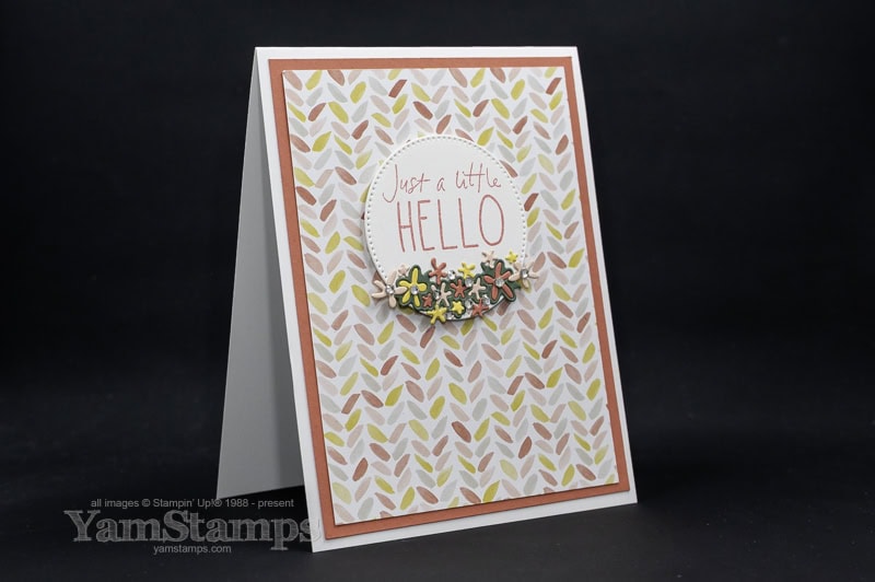
Today’s card isn’t one of my quickest designs. With all those tiny die-cut flowers and leaves, it does take a little more time than some of the projects I share, but that’s exactly what makes it so satisfying to create. Settle in with your favourite beverage (in a cup with a lid on it…), put on some background entertainment (my choice is music or a show that doesn’t require my full attention), and enjoy creating a card that’s sure to wow the recipient.
A Simple Layout with Beautiful Details
Although there are quite a few small die-cut pieces, the overall design is very straightforward. The patterned paper does most of the work, creating a soft background that lets the greeting and floral embellishments take centre stage.
One of my favourite things about this layout is how versatile it is. Swap the greeting for a birthday, thank you, thinking of you, or sympathy card, and simply choose your floral colours from the patterned paper for easy coordination and a polished finish.
A Great Way to Use Your Favourite Supplies
This card is also a reminder to take another look at the dies you already own. The flowers and foliage used on this project come from the Cutest Crew Dies—a set most people probably think of for its adorable cats, dogs, and birds. It’s easy to overlook all the little accent pieces tucked into larger die sets, but they’re often some of the most useful dies you’ll own.
Download the Free PDF Tutorial
I’ve created a free downloadable PDF tutorial so you can recreate this card in your own craft room.
The tutorial includes:
Complete cutting measurements
A full supply list
Step-by-step instructions
Whether you choose to copy the design exactly or use it as inspiration for your own version, I hope you’ll have as much fun making it as I did.
Paper Crafting Doesn’t Have to Be Difficult to Be Impressive
One of the messages I hope comes across in my posts and tutorials is that beautiful handmade cards don’t have to be complicated. This project may have more pieces than some of my usual designs, but the techniques themselves are quite simple. It’s simply a card that invites you to slow down, enjoy the process, and let all those little details come together.
Before you put your supplies away, take another look through some of your favourite die sets. Those little accent dies that often get overlooked just might become the star of your next project. Sometimes it’s the smallest details that make the biggest impact.
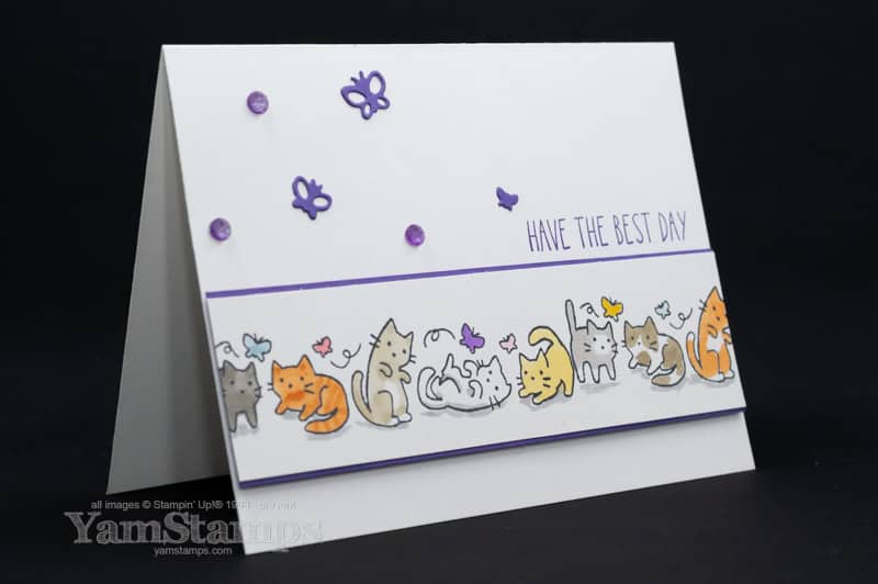
Today is National Kitten Day, so it seemed like the perfect time to share this playful card featuring the Cutest Crew stamp set – and to give you a free downloadable tutorial!
Fun Cat Card with the Cutest Crew Stamp Set
Whether you’re making a birthday card, sending a cheerful hello, or creating something special for a cat lover, this design is easy to personalize and fun to make.
One of my favourite things about this project is how easy it is to make it your own. Change the colours of the cats, swap the colour palette, or shift the position of the image strip for a new look.
For this version, I created a longer line of cats by stamping the image side by side. The Stampin’ Positioner makes this even easier. One of my favourite colouring tips is to add a little shadow beneath your images to help “ground” them. No space kitties here!
I’ve included a free downloadable tutorial so you can recreate this card at home. I hope you have as much fun making it as I had designing it!
If you’d like even more free tutorials, paper crafting inspiration, and practical cardmaking tips delivered each week, be sure to subscribe to my newsletter and come back to visit YamStamps.com.
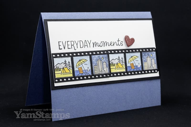
In honour of Nature Photography Day, I’m sharing a nature-inspired project featuring the Capturing Smiles stamp set.
I tend to take a lot of photos of cards and marching bands these days (okay, one band primarily: the Burlington Teen Tour Band), but I still appreciate the beauty that can be found outdoors. This card uses the Capturing Smiles stamp set to create a collection of nature-inspired scenes (and okay, there’s a cityscape in there too!).
One of the things I enjoy about this design is that it can be customized in many different ways. Change the colours, swap the scenes, or adapt the layout to suit your own style.
The scenes are coloured with Stampin’ Blends so it’s still easy and impressive, even though it may take a bit longer to create than some of the cards and tutorials I share.
I’ve made the tutorial available as a free downloadable PDF. Simply click the link below to download the instructions and create your own version of this project.
A card that looks polished and impressive… but secretly comes together without too much fuss.
I created this card for a recent Demonstrator-Only card swap featuring products from the May-August Catalogue (which goes live to customers on Tuesday May 5!).
If you’ve ever wanted to create something that feels finished, but still works on a lower-energy crafting day, this design is one to keep in your back pocket.
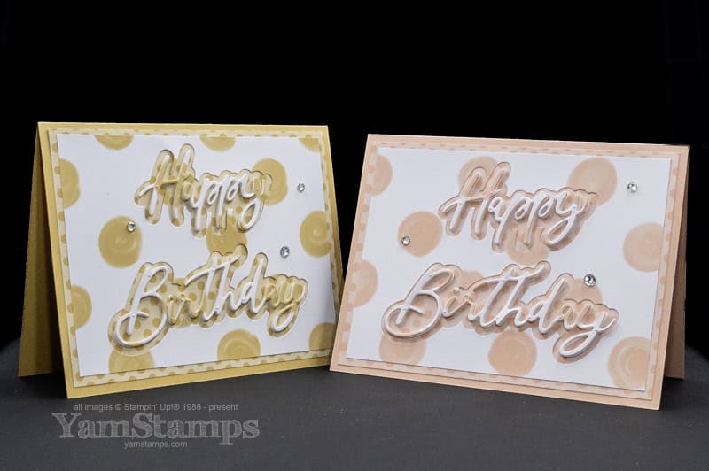
Today’s project uses Golden Glow, Crisp Cantaloupe, and the 2026–2028 In Color Painted Patterns DSP to create a coordinated layered birthday card. There’s a fully linked supply list on the YamStamps Sunday Swaps Page, but please note that the links to the items in the May-August catalogue won’t work until May 5th! Also – while it goes against everything I learned in grade school, I use “Color” because that’s how the product is labelled….
The background is created using a single sheet of Designer Series Paper! The small dot pattern is one side of the sheet, and the large dots are on the other. One 4″ x 12″ strip will create one cardfront so it’s easy to create a few of these cards at the same time.
Let the Thrifty Sentiment Be in the Spotlight
The Words & Wishes Dies really shine in this design, particularly because they are popped up on a Foam Sheet. Thrify crafting for the win – and super coordinated flow. After I die cut the background from the large dot DSP, I stuck the cut outs onto a foam sheet and then die cut the sentiment from that. When you adhere the sentiment into the negative spaces, you’ll see how the pattern flows across the words and creates cohesion! The trickiest part of this project was making sure I didn’t lose the dot to the “i”…
HINT: In my experience, the large random dot pattern is a bit more forgiving than a smaller, more solid pattern, and circles are always more forgiving than hard edges like rectangles or stripes.
Add Just Enough Sparkle
Rhinestones are one of my most favourite all around accessory to add to a project. They catch the light, draw the eye in and give that finishing touch.
Application Hints:
Space them out
Create a loose visual triangle
My preference: odd numbers
One Design, Endless Variations
You may know this about me – but I don’t want to use up all my brain cells for crafting (typically I craft at the end of a work day so I don’t have many left over!!). With this one design, you can create so many looks – swap out the paper you use, swap out the colours for a whole new take. The Words & Wishes Dies have a number of coordinating sentiments and backdrops so you can swap out the sentiments as well!! That’s why I love card designs like this – paper crafting doesn’t have to be difficult to be impressive.
Your Turn
If you’ve been wanting a go-to birthday card that you can recreate without overthinking every step—this is a beautiful one to try.
Pull out your supplies, pick your colour, and give it a go.
And when you do:
Are you leaning Golden Glow or Crisp Cantaloupe?
Did you keep the background soft or go a little bolder?
Comment below, save this layout for later, or share your version—I’d love to see what you create.
First of all, it’s the sense of loss and grief that’s felt – you, as well as the person who has suffered the loss. I often feel more anxious and pressured to “get it just right” – wanting to make a sympathy card that is beautiful, thoughtful and appropriate, which is particularly difficult at a time when I’m not feeling very creative or crafty.
It’s often said that cards are a hug with a fold in the middle, and I think that sympathy cards are definitely an example of this. Those who receive handmade cards feel cared for and seen. Your time, your creativity, your words—especially when shared during difficult times—can carry deep comfort and meaning. If I can, I often like to include a favourite memory of the loved one – because that was one of the things that would bring a smile to my face in the past when I’ve received sympathy cards.
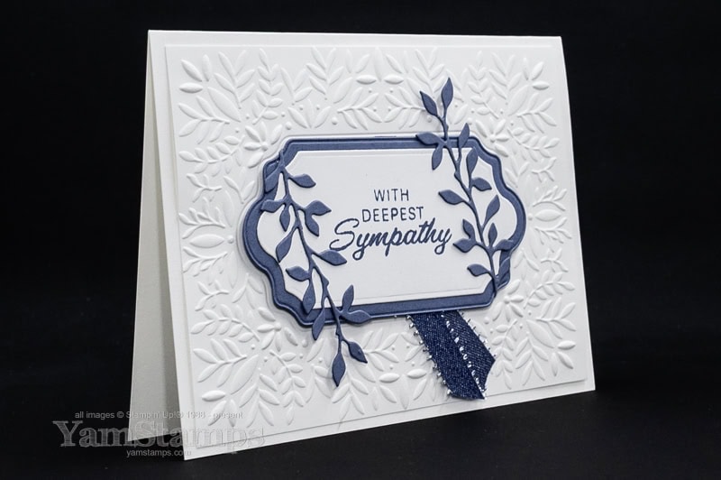
I’ve found it helpful to create sympathy cards to have in my stash – because I often don’t feel like making a sympathy card when I actually need one to send. This sympathy card was the second design that I created for the recent Stampin’ Up! Canada September-December 2025 Mini Catalogue card swap. For a linked supply list for this card, please see the YamStamps.com Sunday Swaps Page – where I share linked supply lists for swap cards that I receive (and make)!
Sympathy Card Making Tips
I love monochromatic colour schemes, and I think they are particularly good for sympathy cards – very calming and peaceful, especially if you choose more muted tones. To keep one colour cards from being too boring, texture from Embossing Folders or simple die cuts add interest without being too distracting. Nature themes, not necessarily florals – leaves/greenery, nature scenes (lakes/trees), birds are all good options (as well as florals). I also prefer simple embellishments if any, and nothing too “blingy” – but that’s me, and the person that you are making the card for may like bling and appreciate that more! That’s the joy of making your own cards – you can customize it for the person receiving it.
Sympathy cards can be difficult ones to make, but they are always appreciated.
Ready to Stay Inspired?
If the thought of beautiful, easy card projects lights you up, I’d love to share more with you! Sign up for my weekly newsletter to get exclusive tutorials, time-saving Stampin’ Up! tips, and creative inspiration delivered right to your inbox—just for amazing people like you who deserve a little crafting me time.