Landscape or portrait? What’s your preference?
Do you tend to create cards in one orientation? Landscape or Portrait? I find I tend to favour portrait cards – those that are taller than they are wide – so for me, it’s good to create a landscape card every once in a while. There are definitely some images or die cut shapes that force a certain orientation for your finished card based on their size….but that’s not very often, really.
This is a card that we recently created in Club – I created the landscape/top fold card ahead of time as the sample prototype….but during our Club session, I created the portrait/side fold card. Can you spot the other difference?
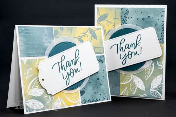
I left a small gap between the papers for the landscape card, and decided not to leave any space for the portrait one. You could choose either option for either orientation – there’s enough room in any case! (I think I prefer the one without the gaps….)
The other thing that I love about this card is that you can get four similar cards from your cuts. I cut four sheets of the Hello Irresistible Designer Series Paper the same way and then just mixed and matched the pieces…though I think I managed to get two sets that were exactly the same for my sample cards!! I find I typically make the sample card, and then I cut and prep for all the club members plus another set for me to make “live” with them….so it just figures I’d get the same set LOL. That being said, it’s not like I’ll be giving the same card to the same person…so I think it’s safe. Plus – landscape or portrait – think they’d realize it’s the same paper layout? (I actually had to look twice myself).
The sentiment is from the Good Feelings stamp set. This is a fantastic set of large greetings that are perfect for card sending occasions – thanks, encouragement, support, celebration…. It’s a good one to have in your crafting room stash. Stamping onto a tag die cut with the Tailor Made Tags is an easy way to add a sentiment to your cardfront, and I love that the stitching effect is echoed in the Stylish Shapes Die Cut circles behind the tag.
So next time you are sitting down to make a card, consider flipping it on its side! It’s something I share in the YamStamps Sketch System Subscription – showing a variety of ways to change up a single card design to get a bunch of different looks. Every four weeks we start again with a new sketch and different samples! You can start your subscription at any time. It’s a great way to just jump in and get crafting, rather than trying to figure out a design layout every time. Check it out at https://go.yamstampsmore.com/sketchsystem. I think it’s a great way to supplement your crafting – you can still be original with your ideas, but you don’t have to do that every single time! Paper Crafting Doesn’t Have to Be Difficult to Be Impressive!!

