Aug 7, 2013 | MDS, Occasions, TV/Video/Web/Tech
I’m set to show all sorts of fun items that you can make for your wedding day on CHCH TV’s Morning Live program at 9:15 today. I’m so appreciative of the opportunities that the cast & crew have given me to share papercrafting ideas and tips! When I was asked to participate in the show, I immediately started imagining all sorts of projects that I could share….but I need to keep it to a time limit and not overwhelm the viewers (to say nothing of myself!!). So I’m trying to keep it to the point, which in my case, is coordinating your stationery through colour, texture and/or images. If all goes according to plan, this post will appear just before I go onto air…
What I thought I’d do here on the blog, though, is share something else that you could use for creating wedding items (and something I’m not even planning on showing on TV….because we all know how that goes – I share it here and then don’t get to share it on TV because I run out of time!).
SO – I’m sharing some MDS products that you could use for your big day! I’m highlighting some digital downloads that you can purchase for use in MDS software or in photo editing software to create some professional looking DIY wedding stationery!

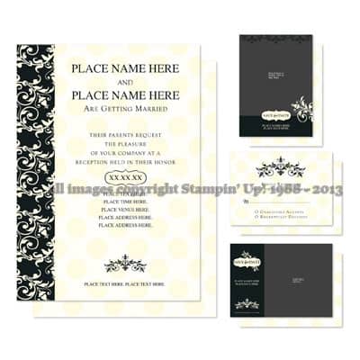
This is the Meant To Be Invitation Template. There is an invitation that you can customize to YOUR colours, and with your information of course! This template also includes a “Save the Date” card and RSVP card as well. You can edit and customize it, then send it to be professionally printed, or print it yourself! It’s a very classic style and the coordination helps present a unified theme.
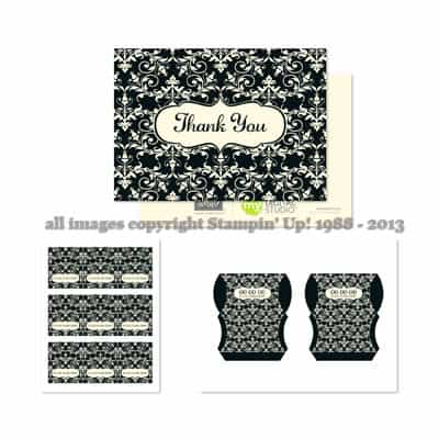 There is also a coordinating Meant To Be Ensemble that features a thank you card, place cards and a pillow box template for favours. Again, you can choose to have your items professionally printed, or print them yourself. In the case of the place cards and pillow boxes, I’d probably be tempted to do it myelf, for sure.

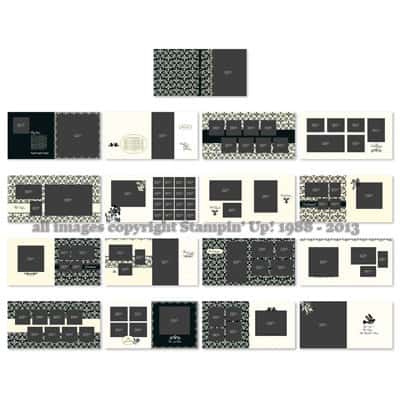
Last but not least, to preserve your memories, there’s a photobook template. Drag and drop your photos, add your text and get it printed.
All of these items can be used in MDS (the program formerly known as My Digital Studio) which only costs $24.95 (make sure you use the link and have me as your demonstrator to get that pricing, if you go through the Stampin’ Up! store, you’ll pay $27.72). The download files are also available for use in other software, such as Photoshop or other editing software that can manage .png files, so there’s flexibility in that. (You can download both types of files, too, so you aren’t locked in one way or the other!). Don’t forget that MDS has a free 30 day trial so you can play around with the program before you make a decision (but really, for the price of a few grande lattes, why wouldn’t you just buy the program?! LOL). As well, if you have questions once you’ve downloaded your items, just like an in-person customer of mine, I can follow up with you to see if you have any questions about the product, or need any tips.
As always….if you have any questions, feel free to contact me!
Jul 29, 2013 | Information, MDS, scrapbooking
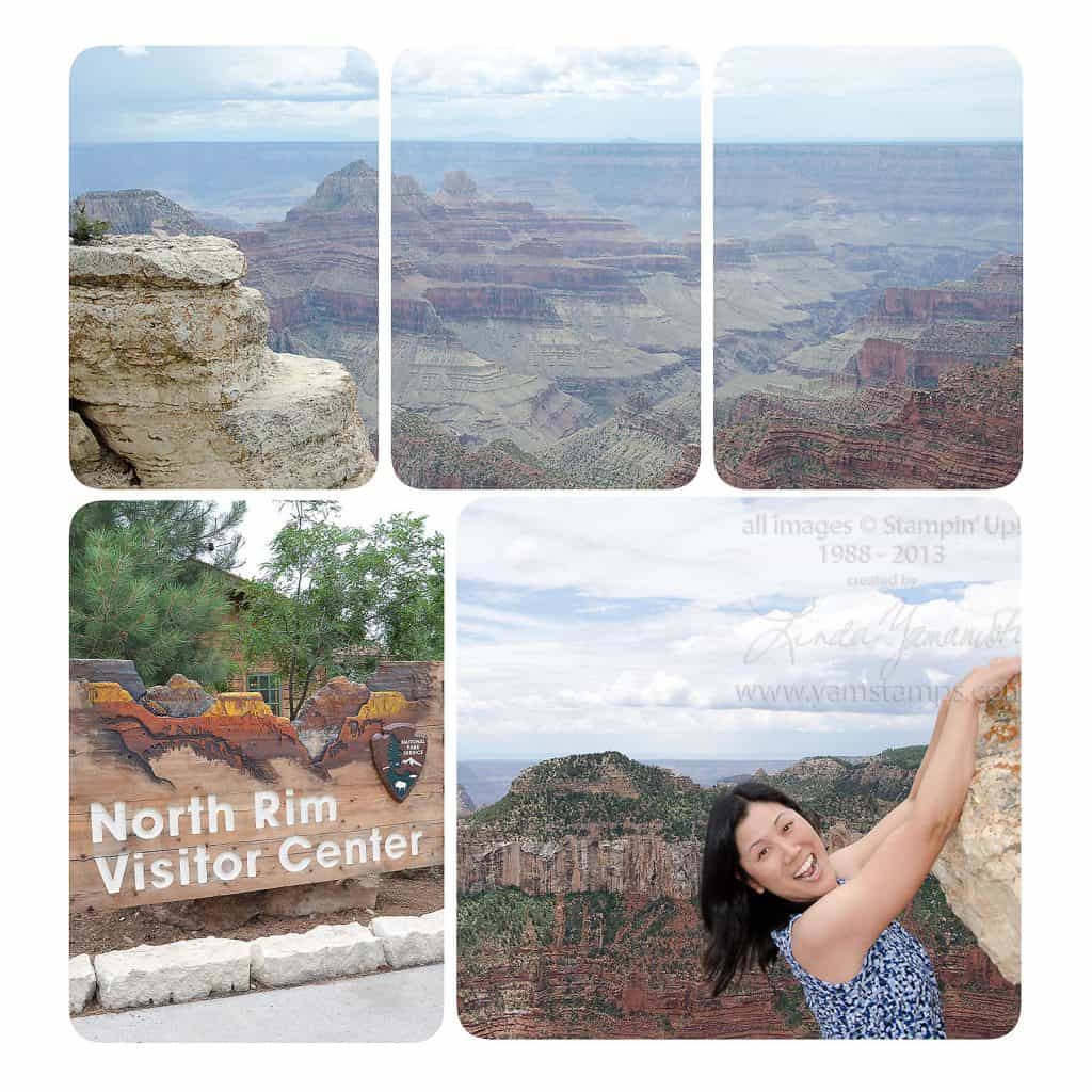
 OK here’s the second page that I created in MDS from my recent girls trip to Utah/Arizona and Stampin’ Up!’s 25th Anniversary Convention. Melanie organized a stay in Kanab, where we stayed in a gorgeous huge house that actually belongs to Shelli Gardner (the co-founder & CEO of Stampin’ Up!)’s family. We toured the factory there and saw the sights, including a day trip to the North Rim of the Grand Canyon. This was my first trip to the Grand Canyon and it was fantastic – and my photos don’t do it justice.
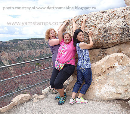
So once again, I used a 12 x 12 photo page template in MDS and added my photos into it. I’ll do a quick video tutorial on how to create the image at the top (so stay tuned!). It’s actually three photo blocks that you “group” together, and then drag & drop your photo into place. It’s a great way to incorporate a larger photo to a pre-set layout. The bottom right photo is a fun set up that I have taken to doing whenever there’s an opportunity… A friend introduced me to this concept a few years back (OK a LOT of years back) when we were at Ayer’s Rock or Uluru in Australia. You find a spot where there’s an outcropping or a downhill slope area, then set yourself up so it looks like you’re hanging off the edge! Again, note that I say it LOOKS like you’re hanging off the edge. You are TOTALLY safe. This being said, we did see some crazy people climbing out to the edge for photo ops, and I couldn’t even look at them – too stressful for me. I have enough stress in my life without adding to it.

Here’s me, Dana and Sue (Sue being the only one who looks convincing in this shot…..) cropped photo ready to go…

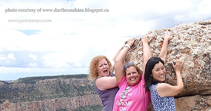
and here’s the uncropped photo showing how we did it (not that you couldn’t figure it out yourself, I’m sure…LOL). This was taken by an innocent passerby that we convinced to take the shot for us (and who didn’t get the instruction to take us from waist up). I’m sure she wondered what the heck we were doing….
We had so many laughs during our time together – I’m so fortunate to have found such good friends through crafting!
Jul 27, 2013 | Events, MDS, scrapbooking
 I think I’ve now recovered from the excitement of Stampin’ Up!’s 25th Anniversary Convention! It was quite the gathering this year, with over 5000 demonstrators from North America and around the world descending upon Salt Lake City to celebrate. A few friends and I arrived in Utah a few days before the start to socialize and tour the area. Our friend Mel was kind enough to organize us for our road trip (and that was quite the job in itself…)
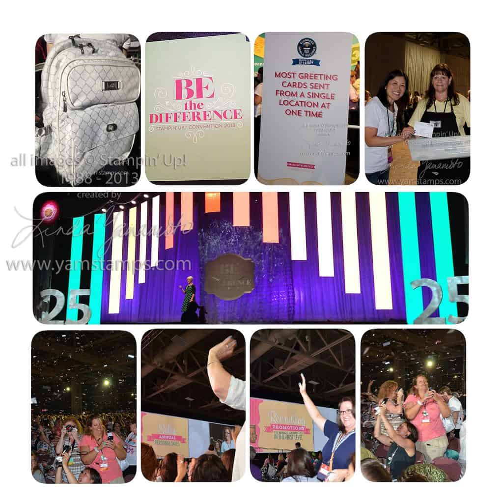
Here’s a page that I did featuring some images from convention – the centre shot is a picture of the stage – the “banners” could be different colours and have different background images on them – very cool. The top photos show the bag we received this year – we demonstrators always look forward to these! It’s a different design each time and comes loaded with supplies that we need to create our “Make & Take” projects (or in my case, “Take & Make”, since I usually just bring everything home and try to complete them then!). I really liked this year’s design, done in a classy white & silver motif. The only downfall….have you ever tried to negotiate through a crowd where everyone has a backpack??!! LOL At the right is me putting my card into the bin as part of the Guinness World Book of Records effort (a successful bid, too!).
The bottom row shows two of my friends getting recognition for their efforts this year in sales and downline promotions, and also enjoying the glitter shower at the end of convention. And…like true scrapbookers, taking photos of the event!!! We always have a fun time at these events, and I look forward to seeing my friends from year to year. Our circle of friends grows with new friends and group members that attend with us too! I’m hopeful that next year more of my demonstrator group will be able to attend with me. (Maybe YOU?!)
I made this page up quickly using a page template in MDS. It’s a 12 x 12 layout on a white background (which in hindsight, I probably should have changed to a different colour so you could actually see the borders of the page…DOH) I simply dragged & dropped the photos I wanted into the appropriate photo slots and was done! Instead of printing this page, I chose “share” and was able to save the page as a jpeg so I could upload here. I love digital scrapbooking because my photos are digital….and this way I can share them in a fun format rather than have them live on my hard drive where nobody gets to see them…
Come back tomorrow & I will share another quick page with you featuring a fun trick that you can do in MDS!
 There is also a coordinating Meant To Be Ensemble that features a thank you card, place cards and a pillow box template for favours. Again, you can choose to have your items professionally printed, or print them yourself. In the case of the place cards and pillow boxes, I’d probably be tempted to do it myelf, for sure.
