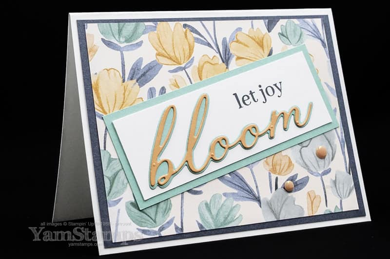
Have an occasion to celebrate? Let Joy Bloom with this card!
I realized that I hadn’t yet shared this card…..and it’s been a hot minute since I posted something on the main blog page – so here’s a card to Let Joy Bloom!
I created this card for a 2025-2026 Annual Catalogue Canadian Demonstrator swap. I like these swaps to see samples created by others featuring stamps and dies that I may not (yet) own! It also forces me to sit down and be creative – and that can sometimes be a good thing, because I’m easily distracted….nothing like a deadline and guidelines to keep me focused!
For this Let Joy Bloom card, I used the Sweet Blooms Bundle, which includes the Sweet Blooms stamp set and Sweet Blooms dies. They’re part of the Florals in Bloom Suite – so if you’re seeing this before the end of June, they can be included in the Sweet Suites Sale! Unfortunately, the Florals in Bloom Suite itself is currently unavailable – the Pretty Florals Dies that are also part of the Suite are unavailable (though everything else in the suite IS available – at time of writing). SO – if you purchase ANOTHER suite that IS available, you could get the Sweet Blooms bundle for 50% off! The Sweet Suite Sale means if you purchase one suite, then you can get a second suite or ANY product that is part of ANY suite for 50% off – but only until the end of June (so don’t miss out!).
I combined the Sweet Blooms Bundle with the Florals in Bloom Designer Series Paper, and then pulled my ink and cardstock colours from that – Secret Sea, Summer Splash and Timid Tiger (all 2025-2027 In Colors). I was going to try to be tricky and die cut the backing “bloom” from the Basic White Cardstock to let the backing layer show through….but it got too complicated and definitely did not Let Joy Bloom! Simple option (but still thrifty) – die cut the backing “bloom” from the backing piece of Summer Splash cardstock; the Basic White Cardstock piece hid the hole, and then I adhered the backing bloom and script word on top. Also easy – putting an Adhesive Sheet on the back of the Timid Tiger Cardstock before die cutting!
Easy but effective crafting – my favourite approach!! Let Joy Bloom! If you’d like to see more samples from the swap, check out the YamStamps.com Sunday Swaps Page!
This So Thankful Beautiful Butterflies Card is a great way to show your gratitude!
I am loving the Beautiful Butterflies Bundle – a hybrid embossing folder (embossing folder and dies) and stamp set – so three tools for one great price! This So Thankful Beauitiful Butterflies card is a great way to show your gratitude – or change out the sentiment to suit the occasion!
I love how easy it is when you can emboss and die cut at one time – and by using a patterned paper it’s even easier and prettier! For this So Thankful Beautiful Butterflies Card, I used the Beautiful Bokeh Designer Series Paper for the large die cut butterfly, and place it onto an embossed piece of Lemon Lolly Cardstock, It’s mounted on a Balmy Blue cardstock base, and that’s also the ink I used for the sentiment. One of the easiest tricks in the book to give your project a coordinated look – pick out colours from the Designer Series Paper you’re using! (they are listed on the back of the packaging…or if you’re like me and sometimes end up with things separated…it’s also listed on the website – shortcut to the Online Stampin’ Up! Canada YamStamps shop is YamStamps.com/shop). Technically, I did cheat a little bit – the colour used in the patterned paper is actually Daffodil Delight, but Lemon Lolly is a coordinating, lighter shade, plus there’s only a bit of yellow that ended up showing on the butterfly die cut.
To finish it off and add a bit more bling, I randomly stuck on sequins from the Itty Bitty Bokeh mix. I found it really handy to pick up the sequin with my Take Your Pick tool putty end, and then dip it into some Liquid Glue that I had squeezed out onto my Silicone Craft Sheet before sticking it to the cardfront. If you’re looking for the “easy” button for this So Thankful Beautiful Butterflies Card, the Beautiful Bokeh Suite Collection includes the stamp set, embossing folder, dies and embellishments that I used for this card. It’s another way to take a shortcut to a project that looks totally put together and coordinated.
If you purchase the suite, you will be able to select one Level 1 Sale-a-Bration item of your choice for free! When you place a product order until February 28th, each increment of $75CAD in a single order will earn you free Sale-a-Bration product! Plus- I’ll send you a tutorial for this So Thankful Beautiful Butterflies card! Shortcut to shop is YamStamps.com/shop or message me if you have any questions or would like to pay by etransfer. If you decide to become part of my demonstrator group, the “Eh” Team during Sale-a-Bration, you’ll be able to select TWO Stampin’ Write Marker families in addition to the “regular” $165CAD worth of product for $135CAD. More information about becoming part of my group of demonstrators here, or reach out if you have any questions. I’d love to have you as part of the “Eh” Team!!
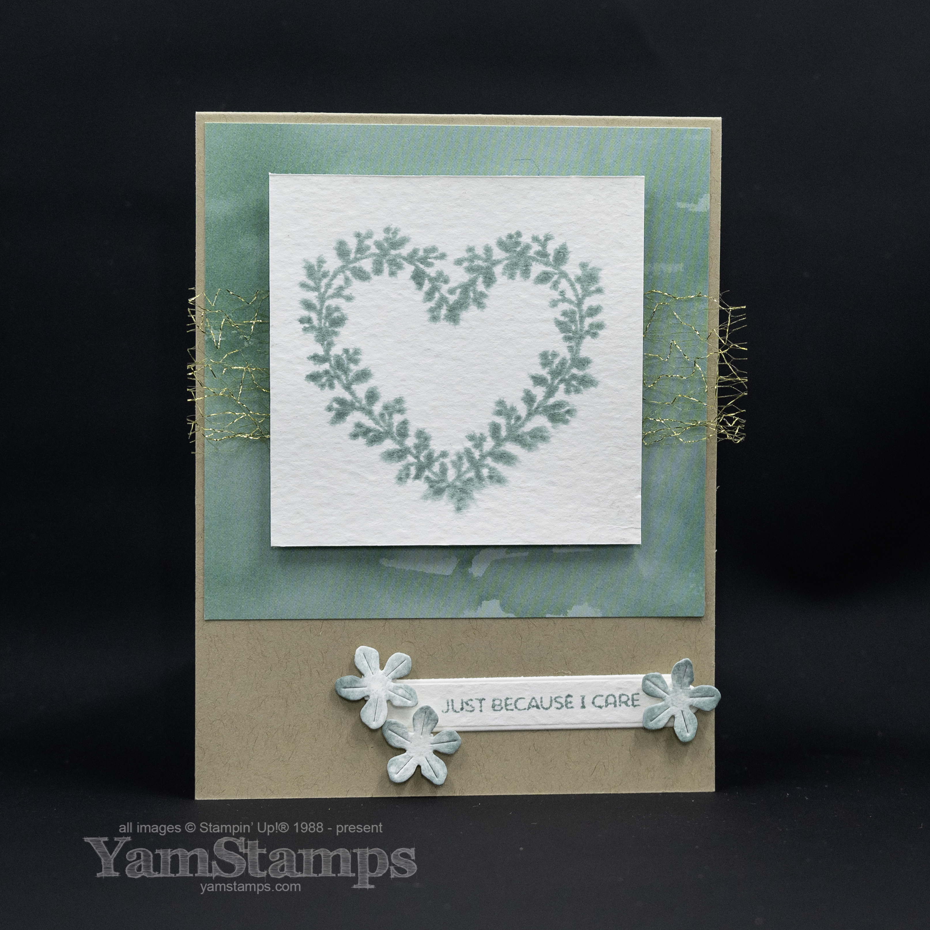
It’s Sunday! Time for a Sale-a-Bration 2025 Share!
Every Sunday (well, pretty much every Sunday), I share a swap card that I’ve either made or received from recent swaps with other Demonstrators on the YamStamps Facebook Page (and the YamStamps Sunday Swaps Page). I was first introduced to swaps when I became a Stampin’ Up! Demonstrator over 20 years ago – it’s an event where you create a card or cardfront, and then make multiples of it. When you meet up with other Demonstrators (typically it was at conventions or other in person events), you would trade one of your card fronts/cards for one that another Demonstrator made. It’s a great way to get new ideas and samples with products that you may not personally have in your own stash.
I honestly can’t remember when this particular swap group started, it might have been around the time of COVID, or before, but this is a mail in swap. We create multiples of the same card, and then send them to the other Demonstrators. This year was a bit tricky due to the Canada Post strike….but in the end it all worked out! In any case, this is my Sale-a-Bration 2025 share!
You can find a full linked supply list on the YamStamps Sunday Swap Share Page. For this card, I used the Heart Shaped Bundle (also available in French) which is a Level 2 Sale-a-Bration item – you can select it as a Sale-a-Bration freebie with a $150CAD product order (single order total, before shipping/taxes, after any applicable discounts). I used a couple of design techniques that always work well for me – monochromatic colour schemes and clean layouts. For this card, the main image (and sentiment) are stamped on watercolour paper. I like using that paper because of its weight and because of the techniques you can use. I spritzed the paper before stamping it to get a soft, watercolour-like image. I used the same paper for the sentiment strip because I wanted it to match. The flowers were die cut from scraps of the watercolour paper (must use every inch possible!!) and then I used a Water Painter to add some ink to the flowers.
What do you think about single colour approaches? Are you one of the “the more colour the better” types or the “keep it simple, stamper” types? (We know which category I fall into haha).
You can shop 24/7 in Canada with delivery to your door (especially now that Canada Post is fully operational again) – shortcut to shopping is YamStamps.com/shop. You’ll be prompted to enter your choice of Sale-a-Bration item once you hit the applicable total product order as well, so you don’t have to worry about doing math!! Thanks for stopping by the page today, and happy shopping!
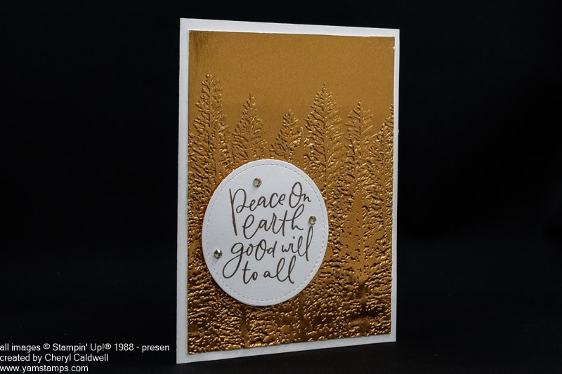
Just popping in to wish you a Merry Christmas, and happy first day of Hanukkah. I hope you are able to spend the day in a way that is meaningful for you!
Sharing this beautiful, simple card from Cheryl – thank you Cheryl!! I love this sentiment and thought it would be appropriate to share today.
I love the look of embossing foil cardstock!
We are spending the day quietly today and will be getting together with extended family (part 1) tomorrow! (the other side’s extended family get together isn’t until January – we are spreading out the holiday joy).
PS If you want to learn more about using your embossing folders, come back tomorrow to check out my Boxing Day Special!
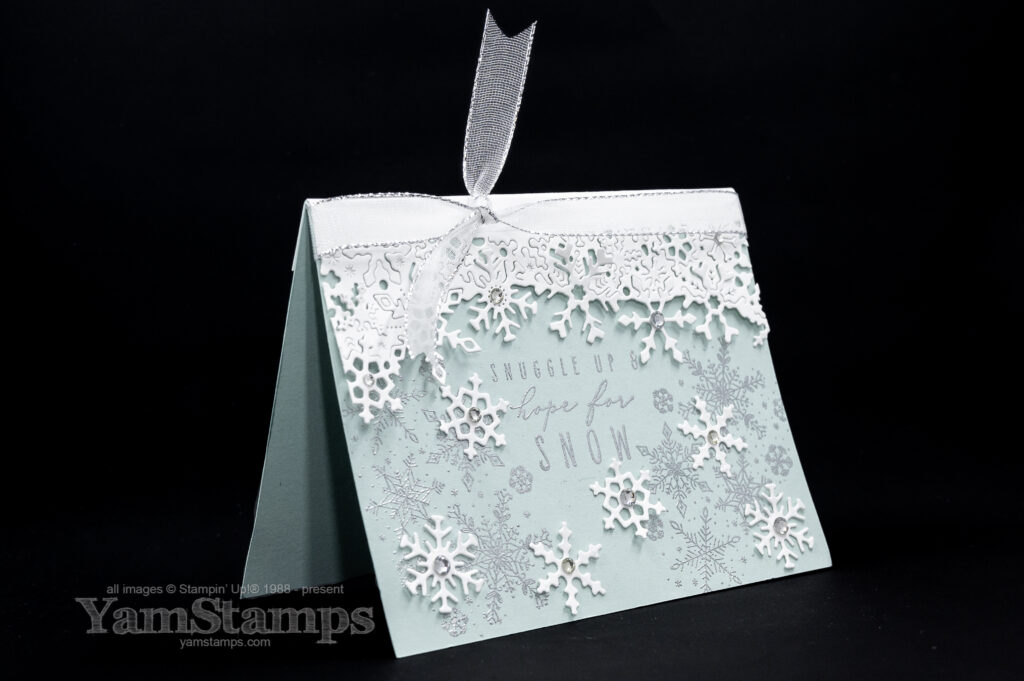
Here’s a beautiful Frozen Edges Snowflake Card to celebrate winter!
Winter is in the air, and what better way to celebrate the season than with a handcrafted snowflake card? This Frozen Edges Snowflake Card features embossing and die cutting, and is perfect for sending warm winter wishes or simply adding a touch of frosty magic to someone’s day.
Whenever the winter seasonal mini catalogue comes out, I have to control myself and not get all the snowflake things. There are certain images or themes that I am always drawn to, and snowflakes are my go-to images for the winter season. I love that you can use them for a holiday card, or an in season card for birthdays or thinking of you! Or if you’re like me, and totally did NOT plan on sending out holiday cards and then got caught short when Canada Post was ordered back to work…..New Years / Winter cards….or perhaps “I know it’s supposed to be spring so why is there still snow” cards…(depending on when I get around to mailing them).
Frozen Edges Snowflake Card
This Frozen Edges Snowflake Card has a few more steps than some of my cards, but really, it’s quite easy to recreate. The Frozen Edges dies are on the Last Chance List right now, so you’ll want to grab them before they’re gone! The Frozen Edges stamp set is already sold out, but you could substitute another snow-themed stamp set for the sentiment and extra images.
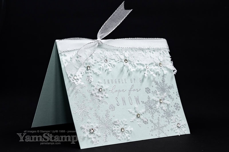
Variations on the Frozen Edges Snowflake Card: change out the colour of the cardstock, or try using vellum for the snowflakes. Stampin’ Up! doesn’t carry vellum at this point in time, but I still have some in my crafting stash – check out this version with vellum….
Frozen Edges Snowflake Card – Vellum Version
Use the Frozen Edges dies to make warm greeting cards!
Come back on Boxing Day to check out my Boxing Day Special, especially if you love Embossing!
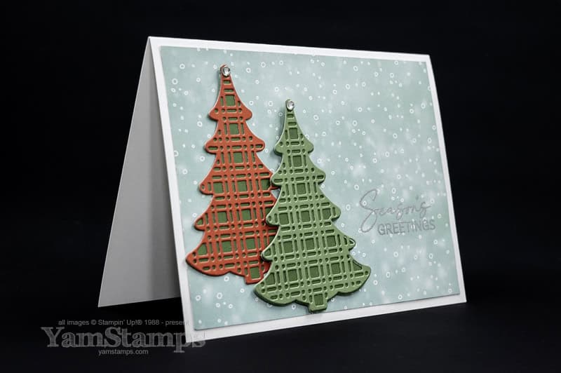
Sharing this plaid Christmas tree card tutorial to spread some joy!
Well, hello there! I’m still here! Sorry for the bit of radio silence there. Anyway, I’m here with a holiday card to share with you – and you can download the tutorial for this plaid Christmas tree card too!
You may remember that I love projects that are easy to make but that are still impressive. The thing that I love about this card is that the paper makes it easy! I have a free download of this Plaid Christmas tree card tutorial for you! I used the new two toned cardstock from Stampin’ Up! – in festive colours, of course. These are from the Snow Day 12″ x 12″ Two-Tone Cardstock package. Each cardstock has a side that is a lighter tone and the other side is the darker tone of the same colour. Makes crafting easy peasy, and especially when there’s coordinating products. The Snow Day cardstock has colours that coordinate with the Snowy Scenes Designer Series Paper and Sticker Sheet.
Hope you enjoy the plaid Christmas tree card tutorial!
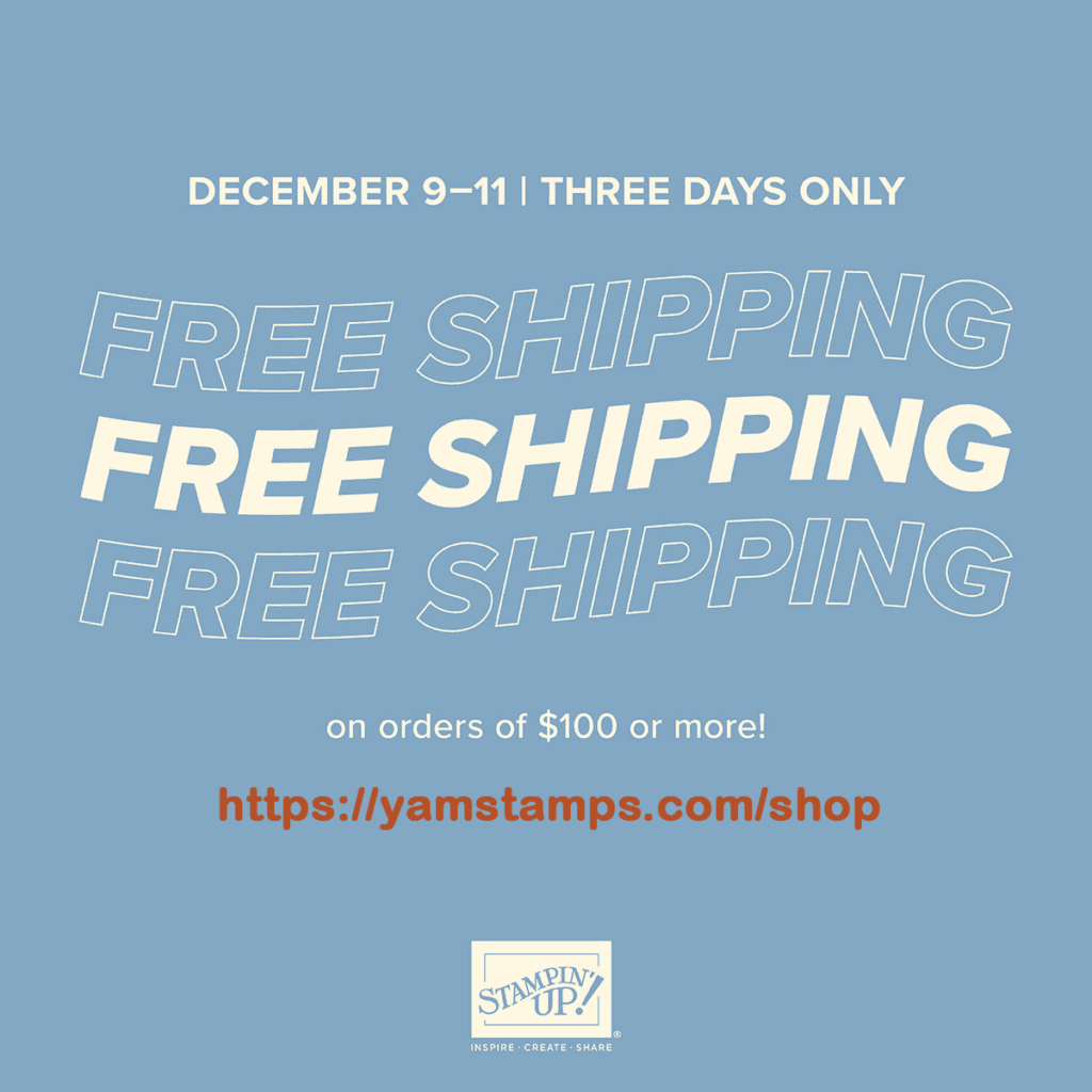
Free Shipping! Dec 9-11
Stampin’ Up! Canada is having a FREE SHIPPING promotion December 9-11 (THREE DAYS!). Pay no shipping fees on product orders of $100CAD! Shortcut to shopping is yamstamps.com/shop. If you have a smaller order, and can do a porch pickup in Burlington ON, message me and I will group together orders so that everyone can benefit from free shipping!
If you need any supplies from the plaid Christmas tree card tutorial, you could shop Dec 9-11 and save some money on shipping!
Please reach out if you have any questions or need assistance placing an order! Happy shopping! Happy free shipping Monday December 9 to Wednesday December 11!